Reporting documentation feedback and keeping it real

Chart showing a high correlation between Comp Sci PHDs and Arcade revenue

In my previous post, If it’s not statistically significant, is it useful? (and every grad-school class I taught statistics), I talked about staying within the limits of your data. By that, I mean not making statements that misrepresent what the data can support—basically, keeping it real.

Correlation is not causation

Perhaps the most common example of that is using correlation methods and statistics to make statements that imply causation. My favorite site for worst-case examples of correlations that would make for some curious assumptions of causation is Tyler Vigen’s Spurious Correlation site.

Here’s a fun example. This chart shows that the number of computer science doctorates awarded in the U.S. correlates quite highly with the total revenue generated by arcades from 2000 to 2009.

Chart showing a high correlation between Comp Sci PHDs and Arcade revenue
An example of the crazy correlations found at https://www.tylervigen.com/spurious-correlations

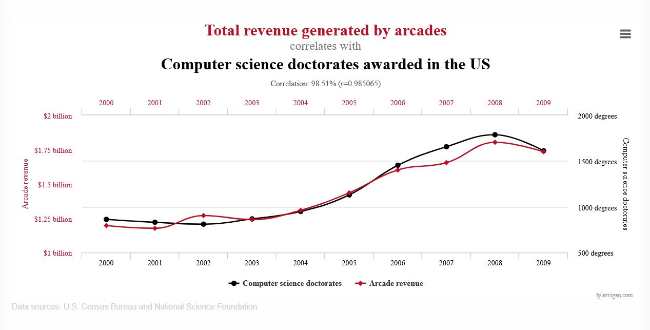
Does this chart say that computer science doctorates caused this revenue? No.

While it’s possible that computer science Ph.D. students contribute a lot of money to arcades or, perhaps, arcades were funding computer science Ph.D. students. The problem is that this chart, or more importantly, this type of comparison, can’t tell us whether either one is true or not. Based on this chart, to say that one of these factors is the cause of the other would be exceeding the limits of this chart.

Describe the data honestly

In my previous post, If it’s not statistically significant, is it useful?, I talk about how the sparse customer feedback in that example couldn’t represent the experience of all the people who looked at a page with a feedback prompt. The 0.03% feedback to page view rate and self-selection of who submitted feedback prevent generalization beyond the responses.

Let’s try an example

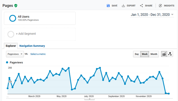
Imagine we have a site with the following data from the past year.

  • 1,000,000 page views
  • A feedback prompt on each page: “Did you find this page helpful?” with the possible answers (responses) being yes or no.
  • 120 (40%) yes responses
  • 180 (60%) no responses

What can we say about this data?

Continue reading “Reporting documentation feedback and keeping it real”

If it’s not statistically significant, is it useful?

A compressed view of traffic in downtown Seattle with cars, buses, and pedestrians from 1975

In all the product documentation projects I’ve worked on, a good feedback response rate to our help content has been about 3-4 binary (yes/no) feedback responses per 10,000 page views. That’s 0.03% to 0.04% of page views. A typical response rate has often been more like half of that. Written feedback has typically been about 1/10 of that. A frequent complaint about such data is that it’s not statistically significant or that it’s not representative.

That might be true, but is it useful for decision making?

Time for a short story

Imagine someone standing on a busy street corner. They’re waiting for the light to change to cross the street. It’s taking forever and they’re losing patience. They decide to cross. The person next to them sees that they’re about to cross, taps them on the shoulder, and says, “the light’s still red and the traffic hasn’t stopped.” Our impatient pedestrian points out, “that’s just one person’s opinion,” and charges into the crossing traffic.

Our pedestrian was right. There were hundreds of other people who said nothing. Why would anyone listen to just that one voice? If this information were so important, wouldn’t others, perhaps even a representative sample of the population, have said something?

Not necessarily. The rest of the crowd probably didn’t give it any thought. They had other things on their mind at the time and, if they had given it any thought at all, they likely didn’t think anyone would even consider the idea of crossing against the traffic. The crossing traffic was obvious to everyone but our impatient pedestrian.

Our poor pedestrian was lucky that even one person thought to tell them about the traffic. Was that one piece of information representative of the population? We can’t know that from this story. Could it have been useful? Clearly.

Such is the case when you’re looking at sparse customer feedback, such as you likely get from your product documentation or support site.

A self-selected sample of 0.03% is likely to be quite biased and not representative of all the readers (the population).

What you should consider, however, is: does it matter if the data is representative of the population? Representative or not, it’s still data—it’s literally the voice of the customer.

Let’s take a closer look at it before we dismiss it.

Understanding the limits of your data

Let’s consider what that one person at the corner or that 0.03% of the page views tell us.

  • They don’t tell us what the population thinks. By not being statistically representative, we can’t generalize such sparse data to make assumptions about the entire population.
  • The do tell us what the they think. We might not know what the population thought, but we know that 0.03% thinks.

The key to working with data is to not go beyond its limits. We know that this sparse data tells us what 0.03% of the readers thought, so what can we do with that?

Continue reading “If it’s not statistically significant, is it useful?”

You’ve tamed your analytics! Now what?

In my last post, I talked about How you can make sense of your site analytics. But once you make sense of them, what can you do with them?

Let’s say that you’ve applied that method and you can now tell the information from the noise, what’s next?

The goal of the method presented in the last post is mostly to separate the information from the noise so you can make information-based decisions as opposed to noise-based decisions.

There are a couple of things you’re ready to do.

  • Reduce the noise
  • Improve the signal

They’re not mutually exclusive, but you might find it easier to pick one at a time to work on.

Let’s talk about the noise, first.

Why is it noisy?

Recall this graph of my site’s 2020 page views.

Graph of DocsByDesign.com website traffic for 2020 showing a lot of variation.
DocsByDesign.com website traffic for 2020

During 2020, I only made one post about how I migrated my site to a self-hosted AWS server. Not a particularly compelling article but, it’s what I had to say at the time—and apparently all I really had to say for 2020.

Based on that, this is a graph of the traffic my site sees during the year while I ignore it. It’s a graph of the people who visit my site for whatever reason—and therein lies the noise. People, or at least the people who visited my site in 2020, visited for all kinds of reasons—all reasons but my tending to the site.

Let’s see if we can guess who these visitors might be. Here’s a table of my site’s ten most visited pages during 2020.

Continue reading “You’ve tamed your analytics! Now what?”

How you can make sense of your site analytics

If you’ve watched any of your website’s analytics, such as page views or unique visitors, you’ve probably seen something like this chart and wondered, what does that even mean?

Graph of DocsByDesign.com website traffic for 2020 showing a lot of variation.
DocsByDesign.com website traffic for 2020

I know that I have, and I studied this kind of stuff for my Ph.D. All this wiggly-squiggly! What’s going on?

I’ve seen this type of graph just about any time I’ve plotted website data for just about any developer doc site I’ve worked on, and I’ve wondered (and had management ask me), does this show anything we should be concerned about? For the longest time, I’ve always answered with a shrug of some sort.

But now, I think there might be a way to makes sense of this data.

Continue reading “How you can make sense of your site analytics”

How to read survey data

As it gets closer to our (American) mid-term elections, we’re about to be inundated with surveys and polls. But, even between elections, surveys are everywhere, for better or worse.

To help filter the signals from the noise, here is my list of tips for critically reading reports based on survey data that I’ve collected over the years.

If you’re a reader of survey data, use these tips to help you interpret survey data you see in the future.

If you’re publishing survey data, be sure to consider these as well, especially if your readers have read this post.

To critically read survey data, you need to know:

  1. Who was surveyed and how
  2. What they were asked
  3. How the results are stated

Let’s look at  each of these a bit more…

Continue reading “How to read survey data”

Lies, damn lies, and statistics

Chart of science-public split on science-related issues (from fivethirtyeight.com)
Science-public split on science-related issues (from fivethirtyeight.com)

The headline from stats web site, http://fivethirtyeight.com/, says Americans And Scientists Agree More On Vaccines Than On Other Hot Button Issues while the headline from Mother Jones, reporting on the same data, says, This Chart Shows That Americans Are Way Out of Step With Scientists on Pretty Much Everything. You wouldn’t know from the headlines that they were reporting from the same data.

If you ignore the text and just look at the data in each chart, while the chart from http://fivethirtyeight.com/ breaks the data out by political-party affiliation, the numbers do appear to be the same (or the same enough). The rhetoric and visualizations, however, are quite different.

Things that make you go, “hmmmm…..”

Or, another way to look at it is that it always pays to go to the source data.

Chart showing opinion differences between public and scientists from Mother Jones
Opinion differences between public and scientists from Mother Jones