
In my last post, I talked about How you can make sense of your site analytics. But once you make sense of them, what can you do with them?
Let’s say that you’ve applied that method and you can now tell the information from the noise, what’s next?
The goal of the method presented in the last post is mostly to separate the information from the noise so you can make information-based decisions as opposed to noise-based decisions.
There are a couple of things you’re ready to do.
- Reduce the noise
- Improve the signal
They’re not mutually exclusive, but you might find it easier to pick one at a time to work on.
Let’s talk about the noise, first.
Why is it noisy?
Recall this graph of my site’s 2020 page views.
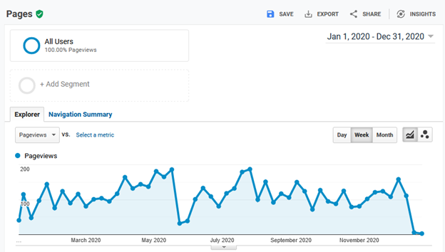
During 2020, I only made one post about how I migrated my site to a self-hosted AWS server. Not a particularly compelling article but, it’s what I had to say at the time—and apparently all I really had to say for 2020.
Based on that, this is a graph of the traffic my site sees during the year while I ignore it. It’s a graph of the people who visit my site for whatever reason—and therein lies the noise. People, or at least the people who visited my site in 2020, visited for all kinds of reasons—all reasons but my tending to the site.
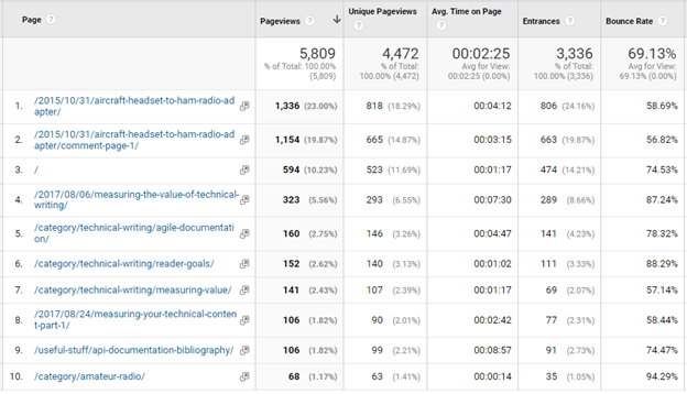
Let’s see if we can guess who these visitors might be. Here’s a table of my site’s ten most visited pages during 2020.
Multiple audiences
This is starting to show a potential source of noise: different audiences. The top two most-visited pages, which account for over 40% of 2020’s page views, are about amateur radio (and 5 years old in 2020). Topics four through nine on that list are tech writing topics that, together, account for about 20% of 2020’s page views.
Just from looking at the table, I can see that I have two distinct audience demographics visiting my site: the ham radio crowd and my tech writing fans. That difference could be a source of the variation seen in the page view data–it’s almost like I have two web sites in one.
Low traffic
Another source of noise is the fact that my site has very low traffic—averaging about 110 page views per week in 2020. A small change in the number of people who visit and the pages they view will have a large impact on the traffic as a percentage.
In 2020, the site averaged 55 visitors per week. If those 55 visitors made an average of 110 weekly page views, each visitor is worth an average of two pages each per week. If only 10 users take a week off, my site’s page views could go down almost 20 %.
No promotion
Another possibility for the low traffic numbers is likely the fact that I didn’t really do anything to call people to the site during 2020. No posts. No tweets. Just random visits.
What can you do with noisy data?
In my case (both here and on the help sites I’ve worked on) I’m not in much of a position to change the factors that contribute to the noise. I could probably promote it more and publish more posts, but I have a day job that’s not writing articles for my blog so, for the time being, I’ll have to live with the noisy data.
Not to worry, noisy data is still data—just a little fuzzy.
Working with noisy data
The keys to working with noisy data are being able to distinguish signals from noise and knowing its limits. The limit lines described in the previous post help you do both.
Sustained variations outside of the limit lines are likely to mean something changed. Variations within the limits are more likely to be from the various factors in the system that I decided not to try and change.
The previous article talked about the various excursions in page views above the limit shown in the following table and how the large, short-lived ones were probably not interesting, yet the smaller, longer-lived one in October was. The latter being more interesting because it correlated to a couple of blog posts made during that time.
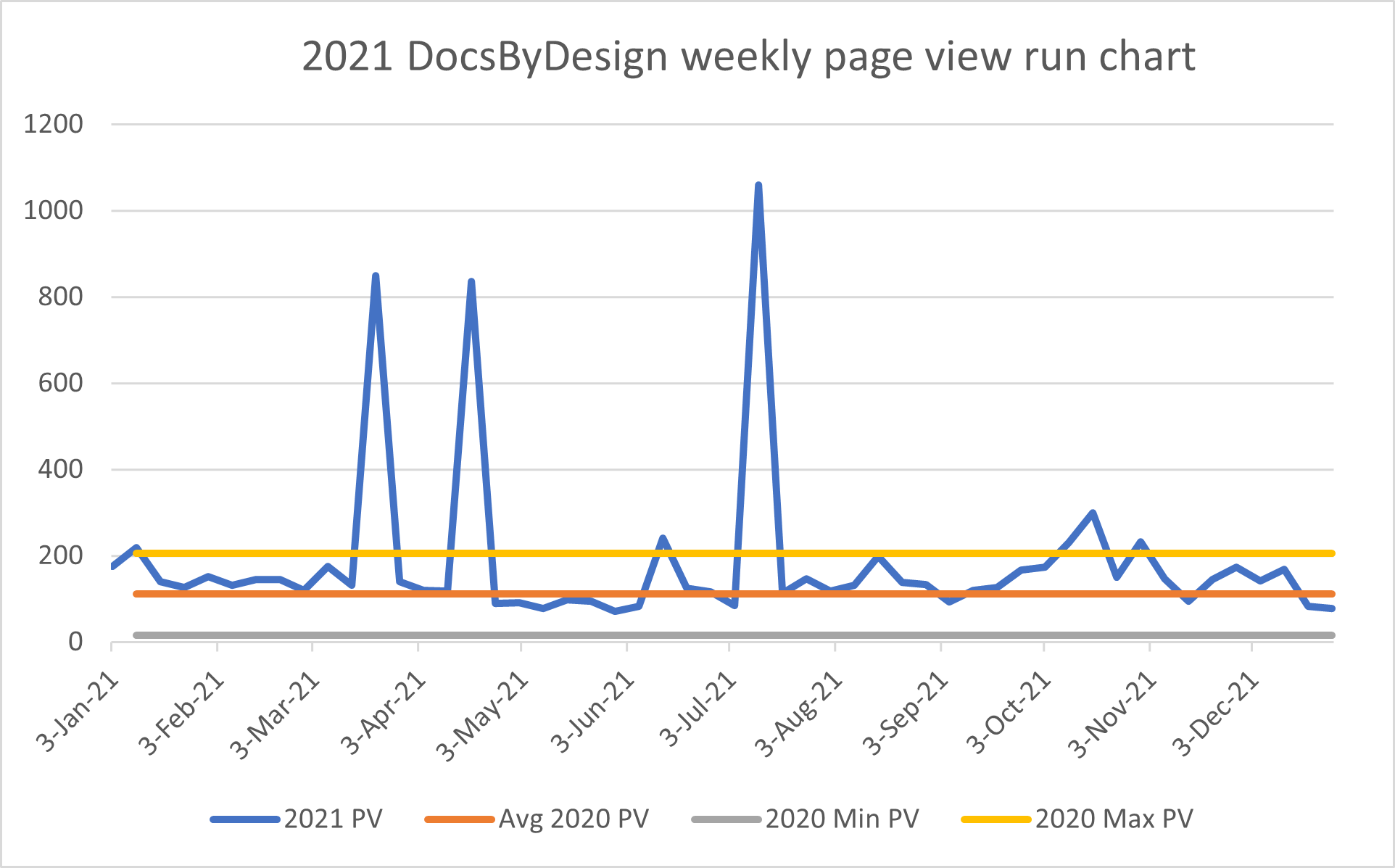
Because the October bump is a change that is both significant (likely not the result of the ambient noise) and correlates to something I did, it’s worth taking a closer look.
Looking into the data
Google Analytics lets you see how those users came to the site by looking at the referrers. Here’s the list of the top 10 referrers for October 2021.
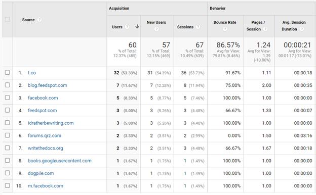
It looks like Twitter (t.co) was my biggest source of new users that month. Tom Johnson’s site, idratherbewriting.com, sent me a few as did writethedocs.org.
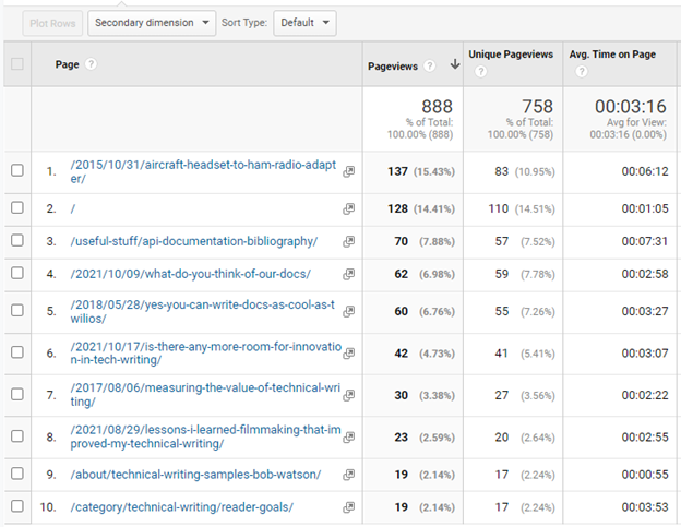
The list of referrers tells us where readers came from, but what did they read when they got here?
This is a list of the top 10 pages for that month. While my ham-radio topic got some views, eight of the top 10 topics (30% of October’s page views) were tech-writing topics.
From this data, I can support the idea that publishing and tweeting about my posts increases traffic to my site. Who could have imagined that? But that [not so startling] revelation is not the point.
Big noise needs a big signal
The point is that for me to be able to conclude that writing and promoting my topics improved the site’s weekly page views, my site’s weekly page views had to increase to at least twice their baseline average of 110 page views/week. If my October articles had attracted, let’s say only 150 page views/week, I couldn’t draw that conclusion because 150 page views/week is still within the limits of my site’s “normal” behavior.
By using the limits to separate the noise from the signal, I can be pretty confident that this change was significant and the result of what I did. With that, I can repeat what I did and see if it happens again. If it does, I can adopt this as my new routine.
After adopting my new routine for a while and seeing its success, I’ll update my baseline to reflect the new normal and try something else to move the proverbial needle.
Lather. Rinse. Repeat.
Who knew that the secret has been on the back of the shampoo bottle all this time?
One Reply to “You’ve tamed your analytics! Now what?”