
If you’ve watched any of your website’s analytics, such as page views or unique visitors, you’ve probably seen something like this chart and wondered, what does that even mean?
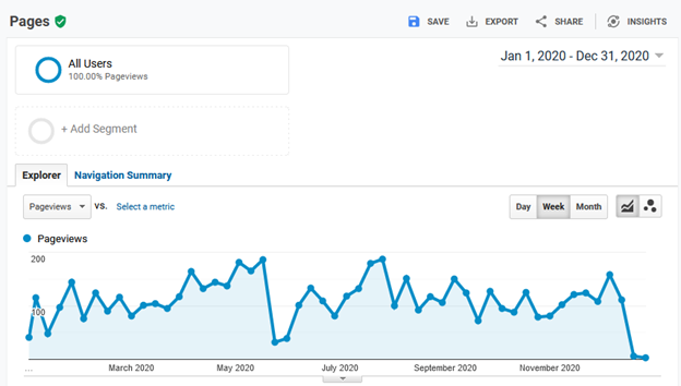
I know that I have, and I studied this kind of stuff for my Ph.D. All this wiggly-squiggly! What’s going on?
I’ve seen this type of graph just about any time I’ve plotted website data for just about any developer doc site I’ve worked on, and I’ve wondered (and had management ask me), does this show anything we should be concerned about? For the longest time, I’ve always answered with a shrug of some sort.
But now, I think there might be a way to makes sense of this data.
Process behavior charts
A while back, I read a book titled, Measures of Success: React Less, Lead Better, Improve More (Mark Graban) in which he describes a way to determine when to be concerned and when not to be concerned when looking at a data set such as this.
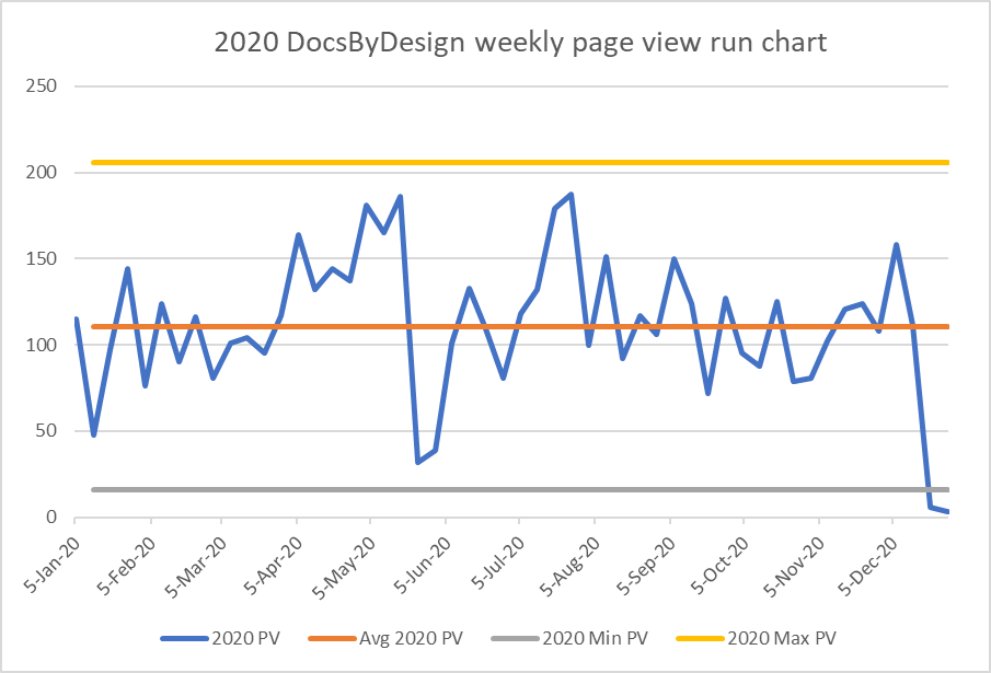
He described how to use a Process Behavior Chart, which is similar to a tool we learned about when I studied for my Green Belt in Six-Sigma. A process behavior chart plots the outcome of a process over time. In my website example, the outcome of my blog-writing process is (hopefully) a few page views. The preceding graph reflects how my writing “process” performed in 2020 (for better or worse).
In Six-Sigma, the first goal is to reduce the variation in the process so that you can figure out how to improve the process—and see the improvement in the data. The idea being that if the data is changing all the time when things are normal, that is when you’re not doing anything special to change them, it’ll take very big changes to see the effect of those changes in the data. The effect of small changes become lost in the noise of the process.
Determine a baseline
But, before we can think of doing anything like improving the process, it’s important to know where we are by gathering a baseline. In this example, I’ll use 2020’s data (shown in the preceding graph) as my baseline.
The book describes a method to identify an upper and lower limit of what you can consider normal process behavior as about three standard deviations above and below the average value of your baseline period. I say “about” because he uses the rate of change between samples and makes some adjustments to the formula that he explains in the book. I’d encourage you to get his book for all the details.
What I like about this method is that it’s accurate enough to be useful and easy enough to be practical.
Here’s what my 2020 process behavior chart looks like:
Create the baseline chart
- Start with the baseline data values (page views per week in this example), shown as the blue line.
- Find the change between samples (ABS([last week’s value] – [this week’s value]).
- Find the average of your data values (Vavg), shown as the orange line.
- Find the average change between samples (Davg), not shown on the chart.
- Find the lower bound (Vavg – Davg * 2.66), shown as the grey line.
- Find the upper bound (Vavg + Davg * 2.66), shown as the yellow line.
Download the spreadsheet with the examples from this post
Compare with the baseline
The book goes into more detail, but basically, with the baseline chart, anything within the upper and lower bounds is normal performance. Even the drastic drop in page views you see near the beginning of June 2020 is just my site doing what it normally does; however, dramatic it might look.
So, nothing to see here.
The data from 2021, shown here, shows a couple of things.
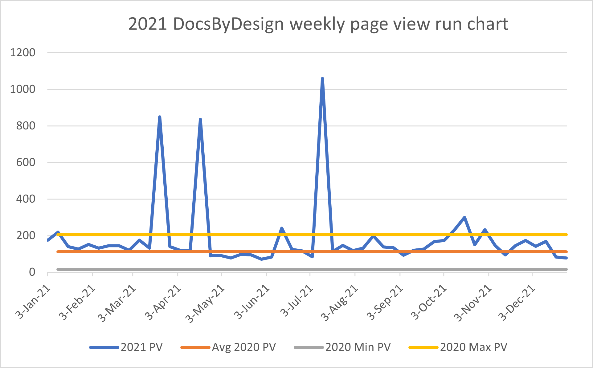
There are three large spikes in traffic during the first half of last year that seemed to be spurious, in that I didn’t post anything, and they didn’t last. So, whatever it was, it wasn’t anything that I did or that had any lasting effect. Net result, I’m not going to look any further into that mostly because their duration is very short, in spite of their magnitude.
In October, however, the page view data exceed the upper bound from 2020 several times. Not as visually impressive as the three spikes from earlier in the year, but they lasted almost a month. They also coincided with a couple of blog posts I published.
From this, you could conclude that writing new posts and promoting them a little bit seems to improve the traffic to my site. (Who could have guessed that?!). While perhaps not the most ground-breaking research finding, it does provide some encouragement.
What I like most about the 2021 example is how it demonstrates the value of this method by guiding you to what warrants attention. With the upper and lower limits, you can see that the large spikes, while dramatic, don’t warrant any concern because they didn’t last. The less dramatic excursions above the upper limit in October, however, should attract your attention because they exceed the upper limit for a several periods. The smaller excursions above the upper limit in October could easily go unnoticed and possibly be overshadowed by the large spikes. Fortunately, by having a baseline and upper and lower limits, they are now clear.
Continue to the next topic, You’ve tamed your analytics! Now what?