Reader goals – Reading to be reminded

This series looks at the different site interactions that readers have with informational sites and is adapted from the full paper on the topic that I wrote with Jan Spyridakis and presented at HCII 2015: Using Readers’ and Organizations’ Goals to Guide Assessment of Success in Information Websites. See the entire series

Reading to be Reminded

Reading to be reminded, or Reading to Do Lite, occurs when readers visit an informational site with the confidence that they already know most of what they need to know about a topic to complete their task, but they just need a refresher. Readers use the website as a form of offline information storage that they may use either online or elsewhere. By knowing the information is available online, readers are confident that they don’t need to remember the details, just where they can find them. Brandt et al. [1] noticed this pattern while observing software developers who “delegated their memory to the Web, spending tens of seconds to remind themselves of syntactic details of a concept they new [sic] well.”

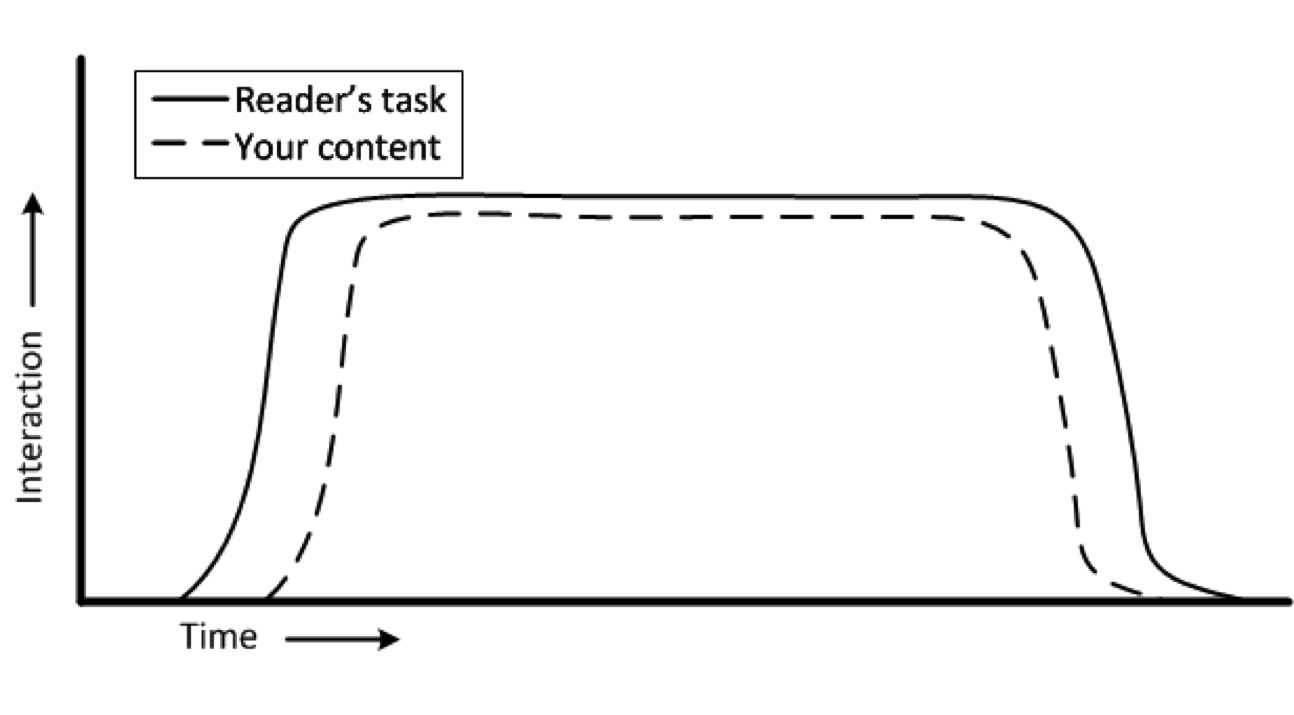
The figure shows how interactions of this type might relate to a reader’s task.

Reading to be reminded

Because, as Redish [2] says, readers will read “until they’ve met their need,” readers will spend as little time in the site as they need interacting with the content. Once they have been reminded of the information they need, they will return to their original task.

Topic design principles needed to serve this interaction include making the content easy to find, navigate, and read. Visible headings and short “bites” and “snacks” of information [2] are well suited to such a goal. However, my research in developer documentation says that these guidelines depend on the specific context–a reminder to know your audience. Knowing your audience is also key to using the terms they will recognize.

Website-based metrics are not particularly helpful in determining the quality of the readers’ interactions. A good time-on-page value, for example, might be short–to the point of appearing to be a bounce, or it might be long. The number of times a page is viewed  also has an ambiguous meaning when it comes to understanding the quality of the readers’ interactions.

At the same time, the readers’ engagement and focus on their primary task (the one that sent them to this content) means asking qualitative information about their experience is likely to be seen as a distraction. Asking about the reader’s experience should be done soon after the interaction and with as brief of a satisfaction questionnaire as possible—perhaps only one question, such as “Did this topic help you?”


[1] Brandt, J., Guo, P.J., Lewenstein, J., Dontcheva, M., Klemmer, S.R.: Two Studies of Op-portunistic Programming: Interleaving Web Foraging, Learning, and Writing code. In: Proceedings of the SIGCHI Conference on Human Factors in Computing Systems, ACM, pp. 1589–1598 (2009)

[2] Redish, J.: Letting Go of the Words: Writing Web Content that Works (2nd ed.). Morgan Kaufmann, Elsevier, Waltham, MA (2012)

Reader goals – Reading to do here

This series looks at the different site interactions that readers have with informational sites and is adapted from the full paper on the topic that I wrote with Jan Spyridakis and presented at HCII 2015: Using Readers’ and Organizations’ Goals to Guide Assessment of Success in Information WebsitesSee the entire series

Reading to Do Here

Reading to accomplish a task in the website, or Reading to Do Here, is characterized by readers interacting with a page in a website to accomplish a specific task through the site. In this interaction, the readers’ goal is to complete the task in the web site. Some familiar examples might include registering for a library account, subscribing to an online newsletter, or renewing a business license.

Readers interact with the content or the site shortly after they decide to accomplish the task and they leave shortly after they finish. The figure illustrates the interaction in such a task.


Reading to Do Here
Reading to Do Here

Readers who use content in this way will want to find the page to help them accomplish the task as quickly as possible and then complete the task as efficiently as possible. While they will want to know that they have successfully completed the task before they leave the website, after they leave the website, they generally won’t remember much about the experience unless it was especially negative or positive.

The figure shows a very common type of web interaction. Web usability guidelines describe the design implications that depend on the site, context, and audience in many texts. Because the readers’ task is performed almost entirely in the context of the web interaction, measuring the success of the interaction is easily accomplished through the site without imposing on the reader. The web server can collect data concerning the time spent in the interaction; the rate of successful operations (e.g., registrations, applications, or whatever the interaction is designed to accomplish); and the path through the interaction (e.g., back tracks, sidetracks, and early exits). Requests for qualitative feedback should occur soon after the interaction so readers’ remember the interaction. While this interaction model is intended for informational sites, it also matches the interaction model of commercial sites, such as shopping or other e-commerce sites. As such, many of the analytics tools and instruments that work in those contexts will also work in this interaction model.

How many topics in a page?

API reference topic type distribution observed in study of open-source API documentation

This question has come up a few times recently and the answer, like the answer to so many technical writing questions is, “it depends,” of course. Which begs the next question, “depends on what?”

Well, at the root, what the reader wants to accomplish, perhaps most critically, how do they want to accomplish it.

I researched this a couple of years ago and found the multi-topic/page format was used in the API reference documentation we studied to be twice as common as the the single-topic/page format.

Graph of API reference topic type by API size
The distribution of API reference topic type by API size

Now, because a format is more popular doesn’t necessarily mean that it’s better. Looking at this chart from the study shows that the format preference shifts towards the single-element per page format with larger APIs. It’s possible that the difference observed is nothing more than an artifact of authoring systems or organizational style guides.

Research on how people construct knowledge, however, tends to prefer the multi-topic/page format (to a point). If you are constructing knowledge about an API, you might look for an overview, some sample code, some explanations of some key methods, go back to the overview, look at some more sample code… Lather, rinse, repeat. Such a learning method is best facilitated by a big topic in which the reader can skip around to see quickly all the related information in whatever order his or her learning style desires. Doing that with each topic in a separate page requires multiple web-server accesses, each interrupting the flow for more time than in-page navigation. While the 2-3 seconds it might take for the page to load doesn’t sound like much, if it breaks the reader’s flow, it degrades the learning experience.

A key part of this learning method is the intra-page navigation–to facilitate meaningful skipping around, or random access to an otherwise sequentially oriented topic. This topic came up in a discussion about the scrollspy feature of Twitter Bootstrap, which provides some very helpful in-page navigation elements. The advantage of scrollspy is that it builds the in-page navigation when the page loads, which makes it much easier for the author (and maintainer) of the topic.

In-flight reading

Photo of in-flight reading material
The collection of in-flight reading material found in the seat back of a recent Alaska Airlines flight

I’m working on a paper for the HCII 2015 conference and thought of the reading material I saw on a recent airline flight. The paper discusses ways to identify the goals of different types of information-focused web content and how to measure how well the content is accomplishing those goals, so now I see this everywhere I look.

This is what occurred to me while I was staring at this collection of literature for several hours.

The Alaska Airlines magazine

It’s goal is to provide the reader with entertainment, er, I mean provide them with advertising, using entertainment as the bait. So how would you measure success? Interaction with the content, maybe? Coupon codes entered, products ordered from the web links, and other interactions traceable to the magazine. Pretty straightforward. Content can be compared to the corresponding advertisement, reader feedback, and the publisher can decide what’s working and what needs work.

The airsick bag

This isn’t really literature, but a good case of “if it’s not easy to use, it’s going to get messy.” I don’t think any amount of documentation could fix a poorly-designed air sickness bag.

The emergency procedures brochure

This is everyone’s favorite reading material, right? It’s goal is to provide important information and provide it in a way that’s easy to understand (quickly, in the worst-case scenario). This is a document that Alaska Airlines (and its passengers) hope to never need, but when it’s needed, it’s value will be immeasurable. How do you track that goal? User feedback? probably not. Survivor stories? Let’s hope not! Maybe usability testing?

The WiFi and the “Meals & Snacks” advertisements

Again, this is purely promotional material whose effectiveness can be tracked by sales. Like the magazine, this is not unfamiliar territory.

What’s this got to do with me?

As a writer of help content, I relate to the emergencies procedures brochure. Sometimes I don’t think anyone reads my content and frequently, Google analytics tends to agree with me. But, I know that in some cases, when those few people need to read it, that’s going to be the most important thing for them to read (if only for that moment). If I’ve done my job right, what I’ve written will save them time and money. I’ll never know that from looking at Google analytics, but, a usability test (even an informal or discount test) will tell me if a topic will be ready to save the day (moment) when it’s called upon to do so.

Back to the paper.

Knowing your audience

Image of earth from space
Where to find our audience

For my PhD dissertation, I ran an unmoderated, online study to see how variations in page design and content of an API reference topic would affect how people found the information in the topic.

For the study, I solicited participants from several software development groups on LinkedIn and a few universities around the country. It’s definitely a convenience sample in that it’s not a statistically random sample, but it’s a pretty diverse one. Is it representative of my audience? I’m working on that. My suspicion, in the mean time, is that I’ve no reason to think it’s not, in that the people who read API documentation include a lot of people. For now, it’s representative enough.

A wide variety of people responded to the 750,000 or so software developers and people interested in software development that I contacted in one way or another. From those invitations (all in English, by the way), 436 people responded and 253 actually filled out enough of the survey to be useful. The 253 participants who completed the demographic survey and at least one of the tasks were from 29 different countries and reported speaking a total of 32 different native languages. Slightly less than half of the participants reported speaking English as their native language. After English, the top five non-English native languages in this group were: Hindi, Tamil, Telegu, Kannada, Spanish.

More than half of the participants didn’t speak English as their native language, but the vast majority of them should have no problem reading and understanding it. Of the 144 who didn’t speak English as their native language, 81% strongly agreed with the statement, “I can read, write, and speak English in a professional capacity or agreed or strongly agreed with the statement, “I can speak English as well as a native speaker.” So, while they are a very international group, the vast majority seem to speak English pretty well. The rest might need to resort to Google translate.

All of this supports the notion that not providing API documentation in any language other than English is not inconveniencing many developers—developers who respond to study invitations in English, at least. An interesting experiment might be to send this same survey to developers in other countries (India, China, Japan, LatAm, for starters) in their native languages to see how the responses vary.

So many studies. So little time.

My theme for 2015

Statue of Janus, the Roman god of beginnings and transitions.
Janus, the Roman god of beginnings and transitions.
During this pause between years, I’ve been pondering the past year and planning the next. Throughout this [unfortunately brief] reflection, I’ve accumulated tidbits of information and inspiration. All of which could be summed up as “consider that one person.” Instead of a New Year’s resolution, I think I’ll adopt that as my theme for the year.

The seed for that theme was planted a few months ago while I was talking with Dharma Dailey, a fellow PhD student at the UW, about her research on tweets made during disasters. Dharma was telling me about how she was looking for ways to find the minority threads amongst the major ones (I hope I got that right). The notion that there might be something interesting in the minority (i.e. the minute minority) was one to which I hadn’t given a lot of thought. But, the seed had now taken root and was watered by subsequent events, which highlighted the idea that:

The vast minority isn’t just interesting, they are very important.

The next event was all the press that Facebook’s “year in review app” got, recently. Surely, the app was designed for their target demographic (although, I can’t say how Facebook defines that). With equal confidence, I’m sure that the majority of the target demo found it as enjoyable as the product manager had hoped they would. But, where did the most notable press about the app come from? The minority. Starting with one, Eric Meyer.

Which spawned a burst of articles like:

Thinking of the vast minority or the outliers in this case could have prevented some emotional pain for (at least) one person and some bad (or at least, unfavorable) press for a product and a brand.

Then I got a tweet from @UsabilityCounts with a link to Mike Monteiro’s presentation at WebStock 2013 about designer responsibility. In his video, Mr. Monteiro presents the case of Bobbi Duncan as one who was seriously troubled (suicidal) by the actions of a product (Facebook, again). But, hey, she’s just one person, right? Think about all the millions who like the feature! I confess, I used to think that way, too. But, as Mr. Monteiro points out so emphatically in his talk, thinking about the vast minority, or even just the 1-person, is not an option, but a professional responsibility. I would emphasize this is true for everyone in the product development process—yes, even the technical writer, if not especially the technical writer.

In any case, this confluence of tweets and posts and other tidbits all lined up in front of me to inspire my theme for 2015: consider that one person. The Eric Meyer. The Bobbi Duncan. To continue to think of the majority–after all they are the target demo–but also not to ignore the individual people in the process, regardless into which demographic segment they fall.

Nobody said it would be easy, but that’s what keeps it interesting.