This series looks at the different site interactions that readers have with informational sites and is adapted from the full paper on the topic that I wrote with Jan Spyridakis and presented at HCII 2015: Using Readers’ and Organizations’ Goals to Guide Assessment of Success in Information Websites. See the entire series
Reading to Do Here
Reading to accomplish a task in the website, or Reading to Do Here, is characterized by readers interacting with a page in a website to accomplish a specific task through the site. In this interaction, the readers’ goal is to complete the task in the web site. Some familiar examples might include registering for a library account, subscribing to an online newsletter, or renewing a business license.
Readers interact with the content or the site shortly after they decide to accomplish the task and they leave shortly after they finish. The figure illustrates the interaction in such a task.
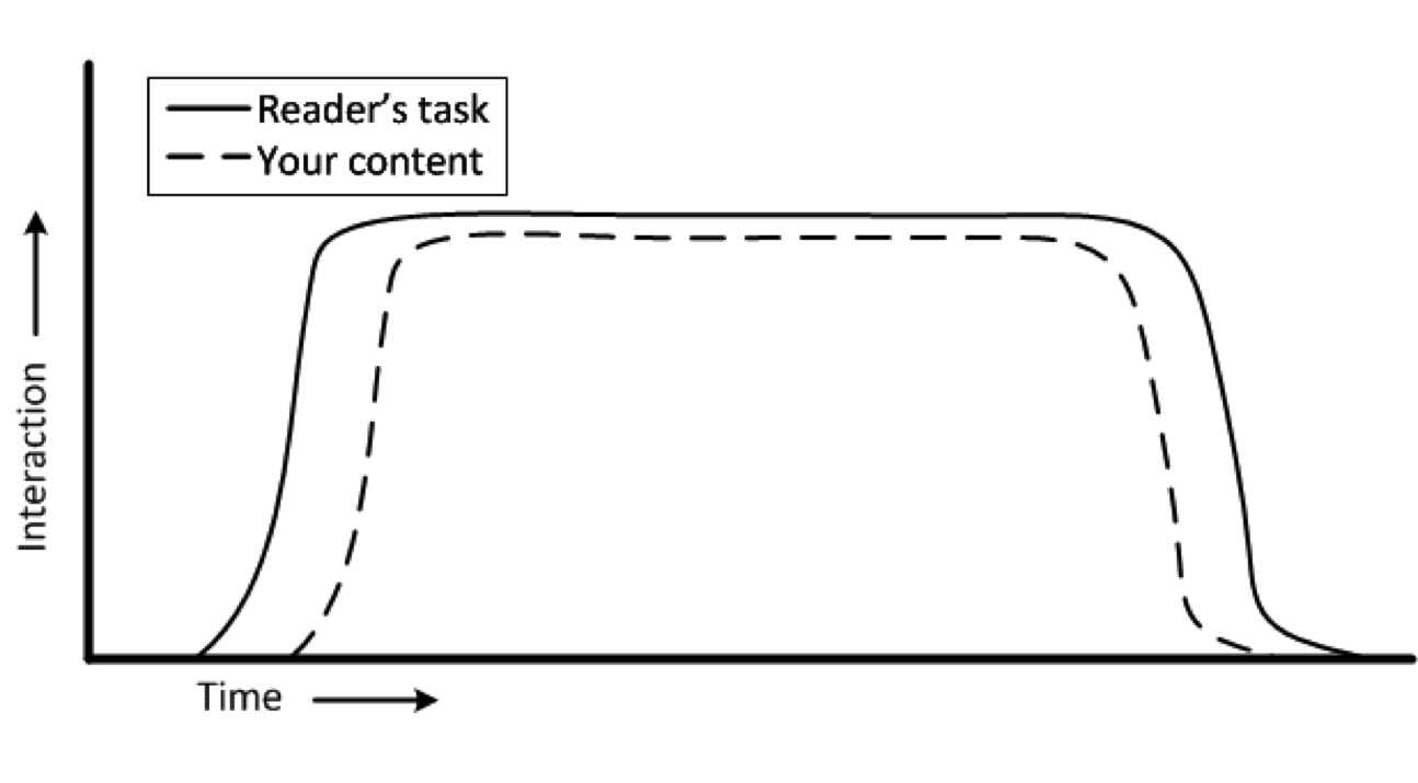
Readers who use content in this way will want to find the page to help them accomplish the task as quickly as possible and then complete the task as efficiently as possible. While they will want to know that they have successfully completed the task before they leave the website, after they leave the website, they generally won’t remember much about the experience unless it was especially negative or positive.
The figure shows a very common type of web interaction. Web usability guidelines describe the design implications that depend on the site, context, and audience in many texts. Because the readers’ task is performed almost entirely in the context of the web interaction, measuring the success of the interaction is easily accomplished through the site without imposing on the reader. The web server can collect data concerning the time spent in the interaction; the rate of successful operations (e.g., registrations, applications, or whatever the interaction is designed to accomplish); and the path through the interaction (e.g., back tracks, sidetracks, and early exits). Requests for qualitative feedback should occur soon after the interaction so readers’ remember the interaction. While this interaction model is intended for informational sites, it also matches the interaction model of commercial sites, such as shopping or other e-commerce sites. As such, many of the analytics tools and instruments that work in those contexts will also work in this interaction model.