

Less is more is a mantra frequently heard in technical writing. When applied to editing, this works out to be something like, “After writing, keep taking the words out until it stops making sense, then put the last word back in.”
While this approach applies to technical writing in general, it comes into sharp focus in user interface (UI) text where both time and space are in very short supply. The reader/user is often in a hurry and there’s no space to put any extra text.
The key to success with such approaches to minimalism is to know your audience. I’d like to share a couple of examples of knowing your audience and how this resulted in two different outcomes.
The examples
The first example is an interface from the piClinic research project I conducted from 2016-2019. In that project, I was trying to learn if limited-resource clinics in Honduras that used a paper-based records with no automation could successfully adopt a small-scale computerized record keeping system. This project was low budget in every dimension, but I’d researched the requirements thoroughly and felt like I understood the user well enough to design a system that would work for them. The field tests in 2019 confirmed that hypothesis.
The second example is from a recent update to the Amazon Web Services (AWS) Console interface that I worked on. In this project, I collaborated with a talented team of UX designers, program managers, and developers to update the interface and improve its usability. My role was primarily the text on the interface; however, the text, design, and implementation are all intertwined.
Compared to the piClinic, the AWS project had much more talent and support behind it. In retrospect, the budget certainly influenced the design and the implementation of each project, but the approach to crafting the words used (or not used) in each of the interfaces had a lot in common.
The text in both interfaces was designed to meet the target users where they are.
piClinic interface

This example of the piClinic user interface was designed to support a common task that the user would perform repeatedly. The context and the terms used in the piClinic UI are familiar to the target audience so the UI needed very little additional explanation.
The design of this interface was the result of interviewing the target users, researching the methods and forms they currently used, and testing and iterating design options.
In field testing, users learned to use the system quickly, even those who had little to no prior computer experience.
AWS IoT console interface
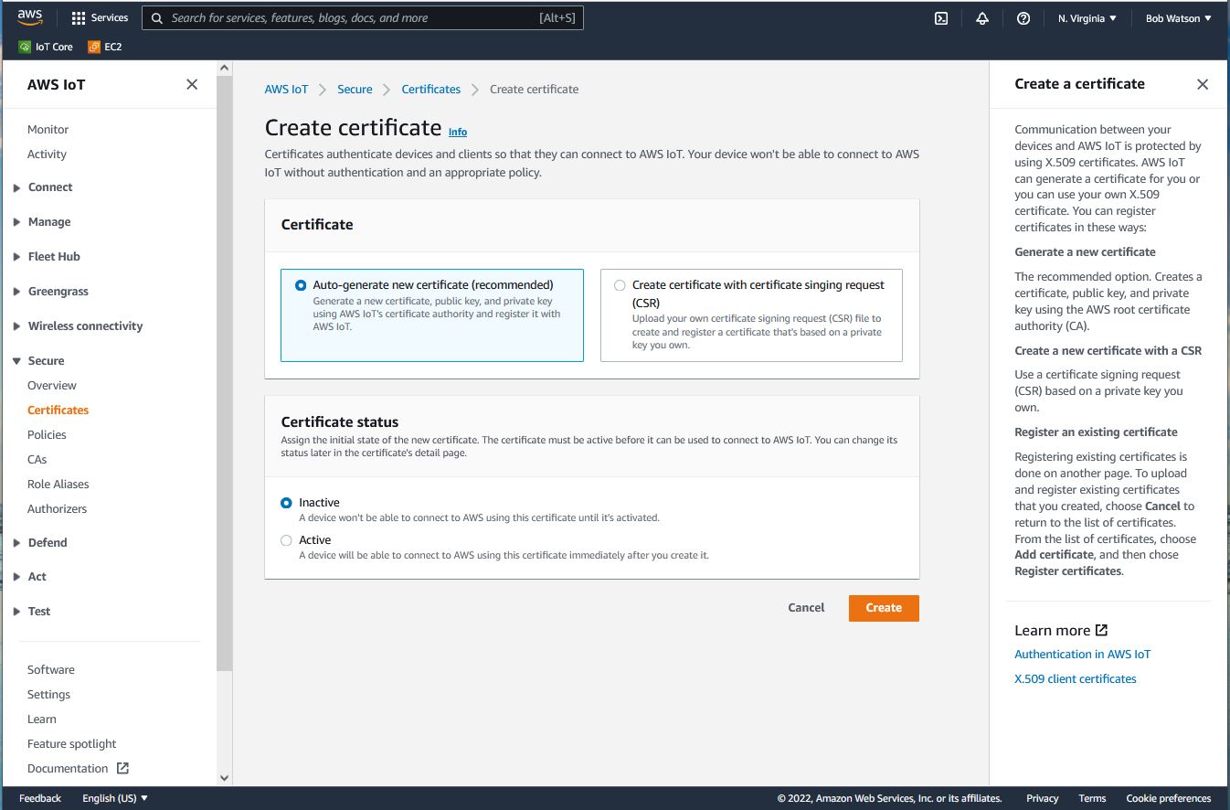
The design of the new AWS IoT console interface had to satisfy users with a much more diverse background than that of the piClinic in terms of familiarity with the system they’re interacting with. As a result, we put much more text into this interface. The information is designed to provide several levels of information that meets the different users where they are, knowing that the users could be coming from a range of backgrounds.
In this design, there are short descriptions of the actions and elements in the interface itself to help remind those who are familiar with the actions in the interface. There’s also a slide out panel on the right that opens when an info link is clicked. This panel contains additional information about the elements in the UI and it also provides links to more extensive documentation.
Although this design is very different from the piClinic’s interfaces, the design processes applied in both projects have a lot in common. This design was also the result of interviewing users, testing various iterations of the design, and meeting the users where they are.
Reflection
To be honest, writing up this side-by-side comparison was a bit humbling. Comparing a project conducted part time by a single university researcher and a few undergraduates to the AWS example that was the result of a team of talented and experienced professionals with the support of one of the world’s largest tech companies behind it is a bit of an apples to cruise-ship buffet comparison. At the same time, it’s rewarding to see that even with a meager university grant, it’s still possible to conduct the research that can inform a successful design.
It’s also interesting how similar design methods yielded such different designs. If you think about it, different situations and users should yield different results. Having a trustworthy process helps provide confidence in the outcome—especially when the outcome varies from one project to the next.
Writing good UI text is challenging
I’ll have to confess that these experiences remind me how challenging I find crafting great UI text. I find crafting UI text to be much harder than writing good ol’ technical docs—even if, or perhaps especially if, you end up with very little text on the UI. It could be because I have ten times more experience writing technical docs than I do writing UI text, but even considering that, it’s still much harder than it looks. It could also be that I had to write the piClinic interface in English and Spanish (which, at the very least, makes it twice as much work). In any case, the job title of UX writer has emerged to address this specialization.
What makes it hard? To provide a great user experience, the words have to mesh like the gears in a clock and you have to be very precise and consistent for those gears to turn smoothly. In more expository technical documentation, you should still be clear, precise, and succinct, but you have more space in which to do it.
It’s also difficult in that the work is developed and published as individual screens in a sequence that might not match how it’s used. In the AWS IoT Console example, the example shown here is just one of maybe 100 interfaces (I’ve been afraid to count them, to be honest) and the piClinic has almost 50 different interfaces. That’s a lot of gears to keep synchronized.
UI text is a critical part of the design
Coming to design from tech writing, I’ve always considered the text to be a material part of a user interface design. I’ll even be so bold as to assert that you can’t design an interface that will have words without including the words in the design process. These experiences definitely reinforced this view.
Can you design a UI with Lorem Ipsum text? You can generate rough design sketches without the actual words, but the words (or the lack thereof) are critical to the success of the interaction with the interface. Further, the implementation of the design is critical to the experience. In both of these examples, the design, text, and implementation were all reviewed and iterated on together to make them all work together and produce the best user experience. It was very hard to review either of these designs without considering all of these elements.
Try it, it’ll make you a better writer
I was going to say, try it, you’ll like it. But, I’d be lying. It’s quite the challenge. If you’re a technical writer looking for a challenge, stretch your legs and work on the text for a UI design. If you’re already an accomplished UX writer, my hat is off to you!