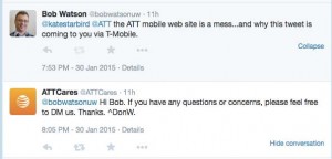
I have to say that I was impressed by ATT’s response to a not-so-complimentary tweet I made last night. While ATT replied 12 minutes after my tweet, the conversation took place three months too late.
I bought my first cell phone in 1992 as a Cellular One customer– back when the phone was the size (and weight) of a brick. I stayed the course through several mergers and 20+ years of technological evolution. But last fall, I’d had enough. What was the last straw?
Their web site
Last fall, I was ready to upgrade my aging iPhone 4 and, like so many others, started my research on the web. As a loyal ATT customer, I started with their site. In fact, I went 80% of the way through the upgrade process several times before I would end up hopelessly confused. The site broke a cardinal:
A web site should never make the customer feel stupid.
Each attempt to make a purchase sent me into a Gordian knot of screens, warnings, seemingly endless and contradictory terms and conditions, to the point I wasn’t sure what I was going to end up paying or getting. Each time, I started out knowing what I wanted (a family plan and a new iPhone), but by the time I bailed out, I wasn’t sure which end was up. I’m sure I’m not the first to say it but,
Why can’t comparing cell phones and plans be easy?
Do customers actually write in and say, “Could you please make your site and terms more complicated? I’m afraid that I almost understand them?” Honestly, I’ve had an easier time navigating a hall of mirrors. I’m not going to publish a heuristic evaluation or usability report (although they can hire me to do that, if they’d like), but as a customer,
I felt like the ATT site had talked me out of being a customer with each interaction.
So, after several frustrating attempts, I finally went shopping and ended up moving the family to T-Mobile. While that was an experience for another blog post, I’m glad to have put it all behind me.
I’m impressed to see they have responsive and proactive customer service agents, and a 12-minute response to a tweet is pretty impressive. If their web site had been as helpful, I might still be their customer.
What can they do?
After all this, it seems only fair that I offer some constructive criticism (if not the entire usability report).
- Describe features in customer terms, not industry jargon. The catchy plan names need to be followed quickly by descriptions in plain English.
- Prices. Just tell me, please. Don’t make me work so hard to become your customer.
- Make the plans easy to compare. Apples to apples, please.
So, I’m glad I’ll not in the market for a cell phone in the near future. With any luck, the next time I am, things will have improved.
