Writing UI text—less is more, taken to the extreme

Less is more is a mantra frequently heard in technical writing. When applied to editing, this works out to be something like, “After writing, keep taking the words out until it stops making sense, then put the last word back in.”

While this approach applies to technical writing in general, it comes into sharp focus in user interface (UI) text where both time and space are in very short supply. The reader/user is often in a hurry and there’s no space to put any extra text.

The key to success with such approaches to minimalism is to know your audience. I’d like to share a couple of examples of knowing your audience and how this resulted in two different outcomes.

The examples

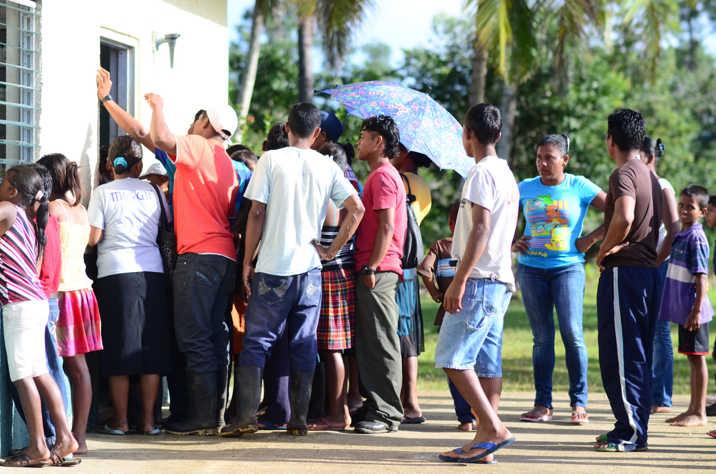
The first example is an interface from the piClinic research project I conducted from 2016-2019. In that project, I was trying to learn if limited-resource clinics in Honduras that used a paper-based records with no automation could successfully adopt a small-scale computerized record keeping system. This project was low budget in every dimension, but I’d researched the requirements thoroughly and felt like I understood the user well enough to design a system that would work for them. The field tests in 2019 confirmed that hypothesis.

The second example is from a recent update to the Amazon Web Services (AWS) Console interface that I worked on. In this project, I collaborated with a talented team of UX designers, program managers, and developers to update the interface and improve its usability. My role was primarily the text on the interface; however, the text, design, and implementation are all intertwined.

Compared to the piClinic, the AWS project had much more talent and support behind it. In retrospect, the budget certainly influenced the design and the implementation of each project, but the approach to crafting the words used (or not used) in each of the interfaces had a lot in common.

The text in both interfaces was designed to meet the target users where they are.

Continue reading “Writing UI text—less is more, taken to the extreme”

I love it when things just work

Bob Watson piloting a light plane on a sunny day as it approaches the runway to land

The image is a still frame from a video I pulled out of my archive to edit and an example of things just working–I’m on the final approach to a silky touchdown at Orcas Island airport.

In user experience parlance, they call that customer delight. I recently had some experiences as a customer that delighted me. It was amazing!

I hope that my readers get to experience similar delight when they read my docs. Let’s unpack these recent delights to see how they might help improve my writing.

The experiences

It really started with a recent disappointing purchase experience, but first some back story.

About 20 years ago, I used to edit videos, among other things. Back then, computers took a lot of tuning (i.e. money) to meet the processing demands of video editing and effects. After several software and hardware iterations, I finally had a system that had the industry standard software running on a computer that could keep up with the challenge of video editing.

With that, I could finally focus on the creative and productive side of editing without having to fuss with the computer all the time. It’s not that I minded fussing with the computer–after all, that’s what I had been doing all along to get to this state of functionality and reliability. Rather, I don’t like fussing with it when I have other things that I want to accomplish.

It was truly a delight to be able to focus on the creative and productive aspects of the job. Having reliable tools made it possible to achieve flow. If you’ve ever achieved that state, you know what I mean. If not, read Finding Flow: The Psychology Of Engagement With Everyday Life by Mihaly Csikszentmihalhi.

Fast forward to this past week.

I finally upgraded my very-consumer-y video editor (Pinnacle Studio) to edit some home videos. I’d used an earlier version a few years back and I recall it having a pretty low learning curve for what I wanted to do. But my version was getting stale, and they were having a sale, so…

I paid my money, got my download, and was ready for the delight to begin!

Not so fast. There would be no delight today.

Continue reading “I love it when things just work”

At the speed of thought

Amy's_lentil_vegetable_soupI returned from a visit to my parents, recently. My parents live in another state–far enough away that it’s difficult to visit them more than once or twice a year.

My father has had Alzheimer’s for several years. For the past few visits, I have met a new father on each visit–the same person, of course, but, at the same time, a different one.

On this trip, I resisted the urge to look for the father from my last visit so I could get to know my new one. While I miss the father I knew, it was rewarding to get to know the one I have, now. He’s just as special to me as the person I saw the last time; but this one is special in his own way.

One evening, as he and I sat at the dinner table with my wife and my mother, he considered a bowl of vegetable soup for a moment before picking up his fork to eat it. This was a bit curious to me. As the soup ran between the tines of his fork with each bite, my mother tried, unsuccessfully, to convince him to use his spoon. My wife observed that the fork was actually the perfect utensil for the task he was trying to accomplish–he wanted to eat the vegetables first. After he ate all the vegetables, he picked up his spoon and finished his soup.

He knew what he was doing all along. Once we were able to move at the speed of his thought, things went much smoother for everyone.

I’m glad I had a chance to meet this father of mine. I’m still learning from him and I look forward to meeting the next one and what he’ll teach me.

Unleash the initiative

This morning on Fareed Zakaria’s GPS (Fareed Zakaria GPS – Aug 30, 2015), U.S. Army General Stanley McChrystal (Ret.) was interviewed about leadership in the context of Gen. McChrystal’s recent book. His interview starts at [10:36:10], a little over halfway into the program.

I liked how Gen. McChrystal started by clearing up a misconception about leadership in the U.S. military–one that I’ve heard from people with no military background and summarized from the transcript here:

Zakaria: …[in] the U.S. Army, you give orders, people listen, your job is to appear imposing.

McChrystal: …everybody thinks that a sergeant tells you to do something and you immediately do it. … In combat, soldiers are much more frightened of the enemy than they are of the sergeant. So they do things for their leaders and their comrades. …so the ability to influence and persuade and build confidence in you as a leader and in what they’re doing becomes the key task.

Zakaria: So, when you looked at…successful examples of leadership, what you found…was a guy who really was able to win the trust of people?

McChrystal: You win the trust of people, and then you unleash their initiative…

Unleash their initiative.

That has a nice ring to it. He went on to describe how to accomplish this.

Zakaria: Somebody wants to be a leader in their organization, in life. What advice would you give?

McChrystal: One, it’s going to take personal discipline… The next thing is empathy. …those core, fundamental, almost value-like traits are the key.

It’s nice to hear that empathy is a core, fundamental, trait…even for an Army general.

Now, to go and unleash some initiative!

Meeting the customer

Photo of people watching the dentist and waiting their turn
Waiting to see the dentist. (From 2014 trip)

My wife and I were part of team who staffed the medical and dental clinic in Rus Rus, a small village 70 miles inland from the Caribbean coast and five miles north of Nicaragua. In our most recent trip to Honduras, I had  time to mingle with the people who came from miles around to visit us in-between my radio-operator duties.

I speak enough Spanish to carry a conversation, but that’s of only minimal benefit it Rus Rus. The majority of people who came to visit us spoke only Miskito. Nevertheless, I managed to chat with a few of the people who spoke Spanish. I didn’t plan to interview them, but my curiosity can be hard to suppress.

I’m fascinated by the insights that simply chatting with the customer can reveal (to the point I’m getting a degree in it). By listening to the locals, I found that our visits are quite welcome by the local population, but they can also be quite an exercise in patience for them. And, that’s after they walk for hours, or days in some cases, to visit us. In keeping with my theme for this year, I consider…

The Story of Luis

When I met Luis, he had been waiting outside the clinic for over a day to have a painful tooth extracted (after suffering with it for several months before our visit). Luis lived about two hours away by truck or five or six hours away on foot. At this point, Luis was getting pretty hungry because the last time he’d eaten was before leaving to come visit us.

The dental clinic is very popular on these trips, and there is always quite a queue for the services they provide–often, there are many more patients in need of dental services than we can accommodate. Not knowing that he might have a long wait to see the dentist, Luis didn’t bring any food with him and returning home for the night wasn’t a viable option. Luis was debating whether to return home (in order to eat) or continue waiting to have his tooth pulled–a difficult decision given the lack of information he had available. I hope he was seen, but I wasn’t able to follow up with him–I had to return to my duties as the team’s radio operator shortly after our conversation.

Fortunately, IHS of MN, the group that organizes the trip, cares about their service. Hopefully, we’ll come up with a way to help people like Luis come prepared for a longer wait, or maybe provide more information about where they are in the queue so they can make an informed decision about what to do. Because they actively seek feedback from the volunteers, I’m sure we’ll do better to make time.

On this trip, I’m glad I was  able to have a chance to see how our visits looked through the customers’ eyes and be able to provide that feedback.

Too little, too late

ATT's quick reply to a recent tweet
ATT’s quick reply to a recent tweet

I have to say that I was impressed by ATT’s response to a not-so-complimentary tweet I made last night. While ATT replied 12 minutes after my tweet, the conversation took place three months too late.

I bought my first cell phone in 1992 as a Cellular One customer– back when the phone was the size (and weight) of a brick. I stayed the course through several mergers and 20+ years of technological evolution. But last fall, I’d had enough. What was the last straw?

Their web site

Last fall, I was ready to upgrade my aging iPhone 4 and, like so many others, started my research on the web. As a loyal ATT customer, I started with their site. In fact, I went 80% of the way through the upgrade process several times before I would end up hopelessly confused. The site broke a cardinal:

A web site should never make the customer feel stupid.

Each attempt to make a purchase sent me into a Gordian knot of screens, warnings, seemingly endless and contradictory terms and conditions, to the point I wasn’t sure what I was going to end up paying or getting. Each time, I started out knowing what I wanted (a family plan and a new iPhone), but by the time I bailed out, I wasn’t sure which end was up. I’m sure I’m not the first to say it but,

Why can’t comparing cell phones and plans be easy?

Do customers actually write in and say, “Could you please make your site and terms more complicated? I’m afraid that I almost understand them?” Honestly, I’ve had an easier time navigating a hall of mirrors. I’m not going to publish a heuristic evaluation or usability report (although they can hire me to do that, if they’d like), but as a customer,

I felt like the ATT site had talked me out of being a customer with each interaction.

So, after several frustrating attempts, I finally went shopping and ended up moving the family to T-Mobile. While that was an experience for another blog post, I’m glad to have put it all behind me.

I’m impressed to see they have responsive and proactive customer service agents, and a 12-minute response to a tweet is pretty impressive. If their web site had been as helpful, I might still be their customer.

What can they do?

After all this, it seems only fair that I offer some constructive criticism (if not the entire usability report).

  1. Describe features in customer terms, not industry jargon. The catchy plan names need to be followed quickly by descriptions in plain English.
  2. Prices. Just tell me, please. Don’t make me work so hard to become your customer.
  3. Make the plans easy to compare. Apples to apples, please.

So, I’m glad I’ll not in the market for a cell phone in the near future. With any luck, the next time I am, things will have improved.

Keeping the design user-centered

Link to presentation
Watch the video of the presentation

This quarter’s speaker series in HCDE (the University of Washington’s department of Human-Centered Design & Engineering) is off to a great start with Paul Elrif’s presentation titled, Please Stop Working on UX No One Really Needs.

Paul presents some examples of UX design gone astray and how UX designers and researchers can help keep it on track.

A key takeaway to ponder from the talk:

“People/teams behave in the way they are rewarded.”

When you know how [the] people [in the room] are rewarded, you’ll know how to reach them. Unfortunately, he says, that too often teams are rewarded for shipping more than for meeting the customers’ requirements.

It’s too bad that he had only 45 minutes because he was just getting to the ‘good part’–what to do about it.

Maybe in his next installment?

Reducing life events to a checkbox

This tweet came to me today, linking this blog post about personal histories and how a simple question on a form can a much more profound impact on the person filling out the form than the form designers might have imagined.

Is there such a thing as a simple question anymore?

  • How many kids do I have?
  • How long have I been married?
  • Where am I from?

I can appreciate her point of view.

These questions might look easy to some, but for me, each one is a blog post in itself.

On the 13th day of my theme for the year, it’s getting more interesting by the minute.


My theme for 2015

Statue of Janus, the Roman god of beginnings and transitions.
Janus, the Roman god of beginnings and transitions.
During this pause between years, I’ve been pondering the past year and planning the next. Throughout this [unfortunately brief] reflection, I’ve accumulated tidbits of information and inspiration. All of which could be summed up as “consider that one person.” Instead of a New Year’s resolution, I think I’ll adopt that as my theme for the year.

The seed for that theme was planted a few months ago while I was talking with Dharma Dailey, a fellow PhD student at the UW, about her research on tweets made during disasters. Dharma was telling me about how she was looking for ways to find the minority threads amongst the major ones (I hope I got that right). The notion that there might be something interesting in the minority (i.e. the minute minority) was one to which I hadn’t given a lot of thought. But, the seed had now taken root and was watered by subsequent events, which highlighted the idea that:

The vast minority isn’t just interesting, they are very important.

The next event was all the press that Facebook’s “year in review app” got, recently. Surely, the app was designed for their target demographic (although, I can’t say how Facebook defines that). With equal confidence, I’m sure that the majority of the target demo found it as enjoyable as the product manager had hoped they would. But, where did the most notable press about the app come from? The minority. Starting with one, Eric Meyer.

Which spawned a burst of articles like:

Thinking of the vast minority or the outliers in this case could have prevented some emotional pain for (at least) one person and some bad (or at least, unfavorable) press for a product and a brand.

Then I got a tweet from @UsabilityCounts with a link to Mike Monteiro’s presentation at WebStock 2013 about designer responsibility. In his video, Mr. Monteiro presents the case of Bobbi Duncan as one who was seriously troubled (suicidal) by the actions of a product (Facebook, again). But, hey, she’s just one person, right? Think about all the millions who like the feature! I confess, I used to think that way, too. But, as Mr. Monteiro points out so emphatically in his talk, thinking about the vast minority, or even just the 1-person, is not an option, but a professional responsibility. I would emphasize this is true for everyone in the product development process—yes, even the technical writer, if not especially the technical writer.

In any case, this confluence of tweets and posts and other tidbits all lined up in front of me to inspire my theme for 2015: consider that one person. The Eric Meyer. The Bobbi Duncan. To continue to think of the majority–after all they are the target demo–but also not to ignore the individual people in the process, regardless into which demographic segment they fall.

Nobody said it would be easy, but that’s what keeps it interesting.