Too little, too late

ATT's quick reply to a recent tweet
ATT’s quick reply to a recent tweet

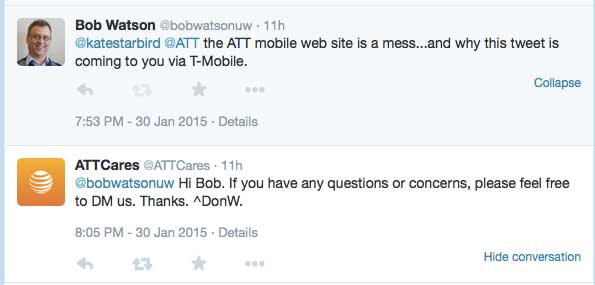
I have to say that I was impressed by ATT’s response to a not-so-complimentary tweet I made last night. While ATT replied 12 minutes after my tweet, the conversation took place three months too late.

I bought my first cell phone in 1992 as a Cellular One customer– back when the phone was the size (and weight) of a brick. I stayed the course through several mergers and 20+ years of technological evolution. But last fall, I’d had enough. What was the last straw?

Their web site

Last fall, I was ready to upgrade my aging iPhone 4 and, like so many others, started my research on the web. As a loyal ATT customer, I started with their site. In fact, I went 80% of the way through the upgrade process several times before I would end up hopelessly confused. The site broke a cardinal:

A web site should never make the customer feel stupid.

Each attempt to make a purchase sent me into a Gordian knot of screens, warnings, seemingly endless and contradictory terms and conditions, to the point I wasn’t sure what I was going to end up paying or getting. Each time, I started out knowing what I wanted (a family plan and a new iPhone), but by the time I bailed out, I wasn’t sure which end was up. I’m sure I’m not the first to say it but,

Why can’t comparing cell phones and plans be easy?

Do customers actually write in and say, “Could you please make your site and terms more complicated? I’m afraid that I almost understand them?” Honestly, I’ve had an easier time navigating a hall of mirrors. I’m not going to publish a heuristic evaluation or usability report (although they can hire me to do that, if they’d like), but as a customer,

I felt like the ATT site had talked me out of being a customer with each interaction.

So, after several frustrating attempts, I finally went shopping and ended up moving the family to T-Mobile. While that was an experience for another blog post, I’m glad to have put it all behind me.

I’m impressed to see they have responsive and proactive customer service agents, and a 12-minute response to a tweet is pretty impressive. If their web site had been as helpful, I might still be their customer.

What can they do?

After all this, it seems only fair that I offer some constructive criticism (if not the entire usability report).

  1. Describe features in customer terms, not industry jargon. The catchy plan names need to be followed quickly by descriptions in plain English.
  2. Prices. Just tell me, please. Don’t make me work so hard to become your customer.
  3. Make the plans easy to compare. Apples to apples, please.

So, I’m glad I’ll not in the market for a cell phone in the near future. With any luck, the next time I am, things will have improved.

In-flight reading

Photo of in-flight reading material
The collection of in-flight reading material found in the seat back of a recent Alaska Airlines flight

I’m working on a paper for the HCII 2015 conference and thought of the reading material I saw on a recent airline flight. The paper discusses ways to identify the goals of different types of information-focused web content and how to measure how well the content is accomplishing those goals, so now I see this everywhere I look.

This is what occurred to me while I was staring at this collection of literature for several hours.

The Alaska Airlines magazine

It’s goal is to provide the reader with entertainment, er, I mean provide them with advertising, using entertainment as the bait. So how would you measure success? Interaction with the content, maybe? Coupon codes entered, products ordered from the web links, and other interactions traceable to the magazine. Pretty straightforward. Content can be compared to the corresponding advertisement, reader feedback, and the publisher can decide what’s working and what needs work.

The airsick bag

This isn’t really literature, but a good case of “if it’s not easy to use, it’s going to get messy.” I don’t think any amount of documentation could fix a poorly-designed air sickness bag.

The emergency procedures brochure

This is everyone’s favorite reading material, right? It’s goal is to provide important information and provide it in a way that’s easy to understand (quickly, in the worst-case scenario). This is a document that Alaska Airlines (and its passengers) hope to never need, but when it’s needed, it’s value will be immeasurable. How do you track that goal? User feedback? probably not. Survivor stories? Let’s hope not! Maybe usability testing?

The WiFi and the “Meals & Snacks” advertisements

Again, this is purely promotional material whose effectiveness can be tracked by sales. Like the magazine, this is not unfamiliar territory.

What’s this got to do with me?

As a writer of help content, I relate to the emergencies procedures brochure. Sometimes I don’t think anyone reads my content and frequently, Google analytics tends to agree with me. But, I know that in some cases, when those few people need to read it, that’s going to be the most important thing for them to read (if only for that moment). If I’ve done my job right, what I’ve written will save them time and money. I’ll never know that from looking at Google analytics, but, a usability test (even an informal or discount test) will tell me if a topic will be ready to save the day (moment) when it’s called upon to do so.

Back to the paper.

Colombia has 11 of the top 100 universities in Latin America

photo of The University of the Andes from El Pais.
The University of the Andes (la Universidad de Los Andes Colombia) – number 5 in this year’s top 100 universities in Latin America

From El Pais (in spanish) Once universidades colombianas entre las 100 mejores de América Latina.

Eleven Colombian universities rated in the top 100 universities of Latin America according to Quacquarelli Symonds, who rates the universities around the world. Here’s the entire list of the top 100 universities in Latin America for 2014 from their site. The Pontificia Universidad Católica de Chile won the number 1 spot this year.


Keeping the design user-centered

Link to presentation
Watch the video of the presentation

This quarter’s speaker series in HCDE (the University of Washington’s department of Human-Centered Design & Engineering) is off to a great start with Paul Elrif’s presentation titled, Please Stop Working on UX No One Really Needs.

Paul presents some examples of UX design gone astray and how UX designers and researchers can help keep it on track.

A key takeaway to ponder from the talk:

“People/teams behave in the way they are rewarded.”

When you know how [the] people [in the room] are rewarded, you’ll know how to reach them. Unfortunately, he says, that too often teams are rewarded for shipping more than for meeting the customers’ requirements.

It’s too bad that he had only 45 minutes because he was just getting to the ‘good part’–what to do about it.

Maybe in his next installment?

User research to the rescue!

A-Team-Logo As Hannibal of the A-Team would say, “I love it when a plan comes together!

I responded to this post in Quora from someone asking for advice on how to improve their website. There was lots of good, 1st-person, advice when I read it, so I suggested that they go to their target demographic ask them what they thought.

Have you tried usability testing it with some people from your target market? E.g. go to a local university with this [home page image] on a tablet, or even just a photo on a clipboard, and ask people a few questions:

a) What does this page inspire you to do? Tell me more about that. (after each question)
b) Where would you click?
c) What would you expect to find after you clicked?
d) Would you sign up for this? Why/why not?
e) What does “verified” mean to you?
f) Thank you! here’s a gift card for a coffee.

If you started after breakfast, I would imagine you’d have a much better sense of what you need to improve by lunch time.

(Read Quote of Bob Watson’s answer to What things can I improve on this home page? on Quora)

Later,  I read this comment to the post.

Bob, I  actually did usability testing today as you advised and got some real feedback from students. It really helped in understanding what would resonate with students.

I also want to do A/B testing to see which messaging converts better. Do you happen to know any resource (website)?

Thanks a lot for your feedback

Happy to help!

Reducing life events to a checkbox

This tweet came to me today, linking this blog post about personal histories and how a simple question on a form can a much more profound impact on the person filling out the form than the form designers might have imagined.

Is there such a thing as a simple question anymore?

  • How many kids do I have?
  • How long have I been married?
  • Where am I from?

I can appreciate her point of view.

These questions might look easy to some, but for me, each one is a blog post in itself.

On the 13th day of my theme for the year, it’s getting more interesting by the minute.


Knowing your audience

Image of earth from space
Where to find our audience

For my PhD dissertation, I ran an unmoderated, online study to see how variations in page design and content of an API reference topic would affect how people found the information in the topic.

For the study, I solicited participants from several software development groups on LinkedIn and a few universities around the country. It’s definitely a convenience sample in that it’s not a statistically random sample, but it’s a pretty diverse one. Is it representative of my audience? I’m working on that. My suspicion, in the mean time, is that I’ve no reason to think it’s not, in that the people who read API documentation include a lot of people. For now, it’s representative enough.

A wide variety of people responded to the 750,000 or so software developers and people interested in software development that I contacted in one way or another. From those invitations (all in English, by the way), 436 people responded and 253 actually filled out enough of the survey to be useful. The 253 participants who completed the demographic survey and at least one of the tasks were from 29 different countries and reported speaking a total of 32 different native languages. Slightly less than half of the participants reported speaking English as their native language. After English, the top five non-English native languages in this group were: Hindi, Tamil, Telegu, Kannada, Spanish.

More than half of the participants didn’t speak English as their native language, but the vast majority of them should have no problem reading and understanding it. Of the 144 who didn’t speak English as their native language, 81% strongly agreed with the statement, “I can read, write, and speak English in a professional capacity or agreed or strongly agreed with the statement, “I can speak English as well as a native speaker.” So, while they are a very international group, the vast majority seem to speak English pretty well. The rest might need to resort to Google translate.

All of this supports the notion that not providing API documentation in any language other than English is not inconveniencing many developers—developers who respond to study invitations in English, at least. An interesting experiment might be to send this same survey to developers in other countries (India, China, Japan, LatAm, for starters) in their native languages to see how the responses vary.

So many studies. So little time.

These are your users

Getting back to this year’s theme, I see this video pop up from time to time in Twitter feeds and the like.

It’s been linked from this article about the Facebook log in and it reminded me of a recent phone call I had with my mother. It reflects the language barrier we encounter whenever she tries to describe a computer problem she’s having.

While we’re both college educated and speak English as our native languages, that’s of little consolation during these long-distance tech-support calls. In the past, rebooting the computer usually fixed the problem, and masked the underlying language barrier. Recently, however, she got some new network hardware, which was giving her trouble. In no time, it turned into an Abbot and Costello routine as we tried to identify the devices like cable modem, DSL modem, router, etc.

Fortunately, she got it figured out with help from my sister, but it reminded me of how we are not our target users.

Not by a long shot!

Well, that was fast, Bob

Just three days after I post about how I was going to consider the minority, I post how  software development documentation should be written and published in just English.

Three days.

Am I ignoring my theme of the year (or the week)?

I don’t think so.

I did consider the rest of the non-English-speaking world (which is actually the majority of the world), when I thought about that. Will anyone be harmed by a lack of API documentation written in Miskito, for example. I don’t think so. If it turns out that they might need it, however, I’ll revise my decision. But, what about in Spanish? Possibly. But, from the information I have available, probably not. Inconvenienced, might be the worst-case scenario.

So, while I won’t be writing any technical documentation for the Miskito people of Central America in the immediate future, they haven’t been ignored in the decision. As a side note, later this year, I will be helping to give them something they need much more than technical writing.

The point of this year’s theme was to consider the vast minority–include them in the design and thought process. So far, I think I’ve done that (for going on four days, now!). The point is to consider them. Include them in the design process. Ask the question, “Will not accommodating the minority hinder, or worse, harm them?” Sometimes it will, such as in the case of accessibility aspects of documentation. Sometimes it won’t, as in the case of translating or writing for people who have no use for the documentation in the first place (i.e. there are other problems to solve before that becomes an issue). In either outcome, they were included in the process.

Four days and counting…

Lost in translation

I’m mixing a some of my favorite themes, music videos that feature dance numbers and technical writing with a dash of Latin culture.

(Bear with me… or skip to the technical part)

Latin pop star, Enrique Iglesias made this video of a song in Spanish. As I write this, it had over 648-million views since it was published April 11, 2014. About 65-million/month.

Released a few months later, on June 13, 2014, was this “localized” version in Spanglish (with mixed Spanish and English lyrics). It has had only 90-million views. About 13-million/month.

Now there are a lot of reasons that could explain such a difference (and 13-million a month isn’t shabby, by the way), but in listening to them both, I’m with the majority and prefer the original.  Both versions are good, but they are different and they each have a unique feel to them. To my ears, the all-Spanish version has more feeling and is a bit more romantic. In comparison, the Spanglish version doesn’t have the same sentiment, to my ears. You can compare the two sets of lyrics for yourself, if you’re interested: Spanish lyrics and Spanglish lyrics.

What’s this have to do with technical writing? (Thanks for hanging in there, by the way)

In code samples and technical documentation, like music (and many other fields), the original is almost always better than the translation. The best information about developing with a software library or API is going to be in the original language, which invariably is English.

So, as a technical writer of developer documentation for a software product with an international audience, should you write in English and/or localize the technical content? In the absence of evidence to the contrary, my default answer is, Yes you should write the documentation in English and No, you shouldn’t localize it. Localization is guaranteed to be costly and not guaranteed to be anything more than marginally beneficial.

Over the years, I’ve collected a lot of anecdotal information on this, but this is one of the things I’ve wanted to study more formally. Anecdotally, international developers believe that the translations aren’t as good as the original English version and tend to prefer the original English version over the same content translated into their language. One reason might be that software has a lot of keywords, class and method names, and the like in English which can’t really be translated. If you read the original, you know you won’t be tripping over inappropriately translated terms.

I have some info from my recent API documentation study, but it’s a bit tangential to this topic.

Yet another study to put on the list.